

Showing posts with label Tsukineko. Show all posts
Showing posts with label Tsukineko. Show all posts
Wednesday, October 24, 2012
Day 294: Jesus is the Reason Card
I needed to make a quick card to enclose with an early Christmas present for my parents. I chose to use this stamp from Paper Inspirations as the main sentiment. I stamped it on craft card stock (Recollections by Michael's) in red StazOn ink, added some paper with the names of Jesus on it (Hobby Lobby), and added a burgundy ribbon from my stash. A quick but meaningful card.


Monday, September 24, 2012
Day 265: Give Me Faith Day 1
Today in my Breaking Free (Beth Moore) Bible Study Class, the leader of the class played the song "Give Me Faith" by Elevation Worship as a way to prepare our hearts, minds, and souls for the video we would be watching. It really spoke to me in that it reminded me of how I felt when I went to Walk to Emmaus. I thought I would make a page of some of the lyrics. I used puzzle pieces from K and Co., stickers by Heidi Grace, and Staz On Ink from Tsukineko and a stamp set from Stampin' Up! to add words to the puzzle pieces. I am letting everything dry overnight and will finish this page tomorrow.
Thursday, August 2, 2012
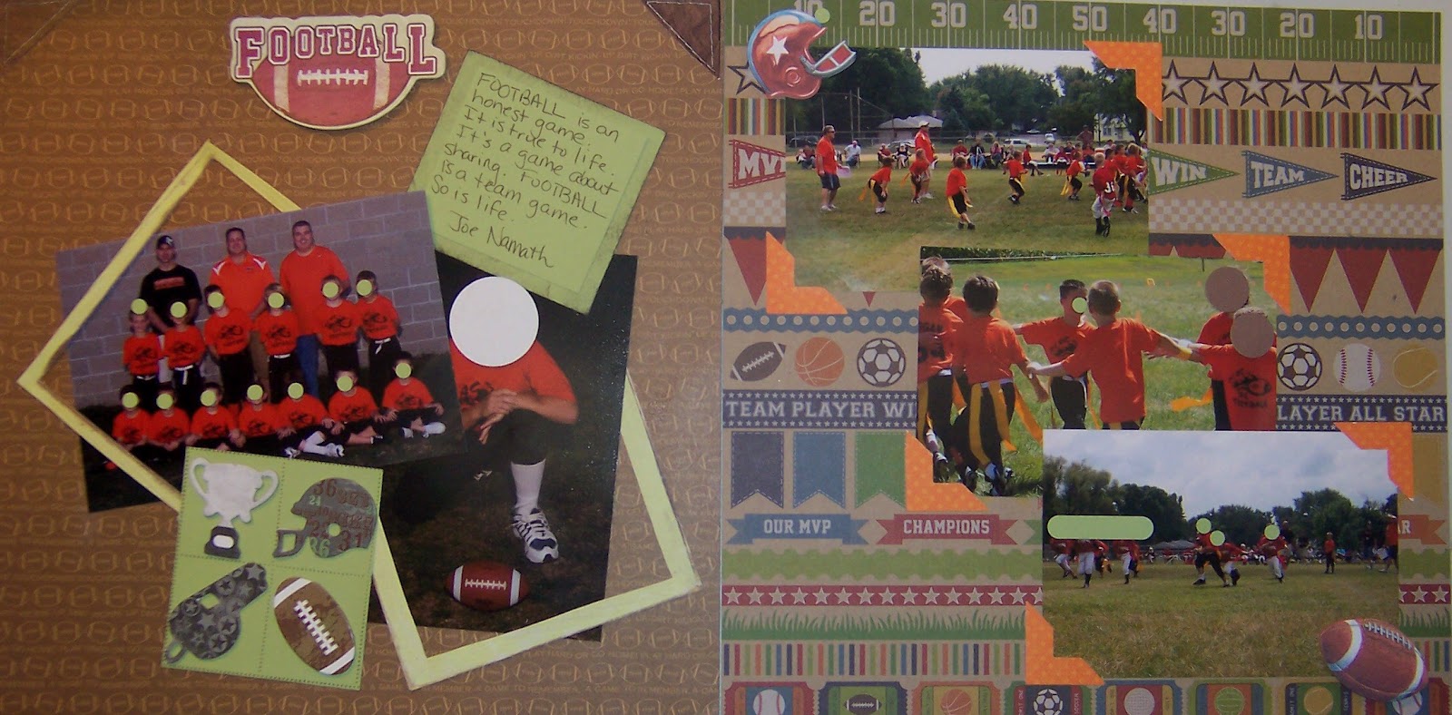
Day 214: Tag Football
For this football layout, I used paper from Bella Blvd as the background on the left page. I framed my son's team photo and individual photo with a frame from Wild Asparagus. I used a similar color green card stock from Stampin' Up! as background for the Joe Namath quote and the grid with the chipboard football icons. The grid stamp was actually part of a 6-frame postage stamp by Just for Fun. Ink was StazOn by Tsukineko.The chipboard title and football icons are by Little Yellow Bicycle. The "leather" corner triangles have been in my stash for ages. They are from Fresh Cuts by Rebecca Sower.
The right page features paper from Jillibean Soup. I simply added some orange photo corners (paper by Bo Bunny) to bring out the orange shirts of the players and to give a little pop from the busy background. I had some sports stickers in my stash, and added the football and helmet to give the page a little more dimension.
While these two pages aren't matchy-matchy, I think the green on the left page ties in with all the grass in the photos on the right page. I also needed something to brighten those dark photos, since they were taken in the early evening and the light was not optimal. I think the orange shirts were tied in on both pages with the use of the orange photo corners.

The right page features paper from Jillibean Soup. I simply added some orange photo corners (paper by Bo Bunny) to bring out the orange shirts of the players and to give a little pop from the busy background. I had some sports stickers in my stash, and added the football and helmet to give the page a little more dimension.
While these two pages aren't matchy-matchy, I think the green on the left page ties in with all the grass in the photos on the right page. I also needed something to brighten those dark photos, since they were taken in the early evening and the light was not optimal. I think the orange shirts were tied in on both pages with the use of the orange photo corners.
Wednesday, July 18, 2012
Day 199: Touchdown Scrapbook Page, Continued
Today I continued working on the "Touchdown" football page of my son. My chipboard letters were dry, so I added some silver dots to the letter "D"( it was manufactured by Deja Views) to match the "MVP" letters made by Little Yellow Bicycle. I used StazOn ink from Tsukineko and silver (heat) embossing powder from Stampin' Up to alter the color of some star clips purchased from Oriental Trading Company. These added a little bit of pizzazz to the dark letters, and, also covered up a flaw in the letter V. Sometimes having to fix mistakes or flaws ends up adding a little extra "something-something" to your work! I also ended up trimming my son's 8" x 10" photo to 4.25" x 10" so that more of the football would show. Don't be afraid to crop your photos...all I lost was some blue background , but I gained a much more interesting scrapbook page because I used an unusually shaped photo.


Saturday, May 12, 2012
Day 133: Cousins Scrapbook Page
I wanted to use this funky flower paper from My Mind's Eye as a background for this page. I made a tag to match by sponging a white tag (Paper Reflections) with blue, green, and fuschia ink from a Kaleidoscope ink pad by Tsukineko. I matted the white tag on green card stock from Stampin' Up! and punched a photo corner from a Paper Shapers punch. I had the fiber in my stash. Paper flowers from Prima helped to tie the page together as the backgrounds for the letters spelling out "Cousins" on the tag. A tattoo from KI Memories, and some buttons from Stampin' Up! added a little punch to the top of the photo.

Sunday, March 4, 2012
Day 64: Candy Land Title and Cards
I wanted to place the title "Candy Land" on the first page of my two-page layout, and at first I thought about using some colorful primary alphabet stickers I had in my stash; but then I decided I would really like the title to use the same letters that are on the Candy Land game itself. I wanted to work on this layout now, and not have to search the internet and then wait to receive something in the mail days from now, or run to area scrapbook stores to see if they had a Candy Land title. So, I copied the letters on the cover of the game box, reduced the size, printed them out on white card stock from Georgia Pacific using my HP Printer, and then fussy-cut them for the title.* I ran the letters through my Xyron adhesive machine. I punched out nine 1.25 inch squares with a punch from EK Success using Real Red paper from Stampin' Up! and attached the letters to the squares. Then I punched out nine 1.375 inch white squares with a punch from EK Success on card stock from Georgia Pacific and attached those to the back of the smaller red squares. I edged the squares in Real Red ink from Stampin' Up! to make it look like there was another layer of red beneath the white. I thought there was not enough contrast between the white squares and the white background paper, but I did not have the next larger size square punch, so this was my quick fix. However, that still didn't give me enough contrast. I really wanted a red title strip to go underneath the letters, but the only red paper I had was 8.5x 11 inches and my scrapbook pages are 12 x 12 inches. I have seen where people paint or ink acetate plastic, so I decided to do that. I have a stash of acetate plastic I have collected from product boxes, so I found a piece that was longer than 12 inches, and cut it to the dimensions I needed to make a title strip for my page (1.75 inches wide by 12 inches long). I inked the acetate plastic with Blazing Red StazOn Ink by Tuskineko and left it to dry overnight. (StazOn ink is permanent on plastic or other slick surfaces, but drying time varies depending on what you are inking, so leaving it to dry overnight was a precaution so I would not smudge the ink.)
I began critiquing the second page and decided that the two matted photos, one embellishment from Jolee's and my journaling block were not enough, and that the page needed more. I decided to copy some of the playing cards and print them out and mat them and then lined them up down either side of my photos.
Satisfied with my progress, I decided to leave this and come back to complete the assembly of the pages tomorrow.
I began critiquing the second page and decided that the two matted photos, one embellishment from Jolee's and my journaling block were not enough, and that the page needed more. I decided to copy some of the playing cards and print them out and mat them and then lined them up down either side of my photos.
Satisfied with my progress, I decided to leave this and come back to complete the assembly of the pages tomorrow.
*Advice on cutting out the letters A and D: to cut out the middle of the letter D: there is a slight separation where the D starts and stops at the top left of the D. Using scissors with a very small, fine blade, cut along that separation and then cut out the center part of the D, following the inside of the D until you get back to the beginning. Advice on cutting out the letter A: make two copies for each A; then cut out the crossbar of the A on one copy and set aside; then cut through the crossbar on the second copy, following the lowercase "n" or upside down "u" shape; glue the crossbar on top of the "n"/ upside down "u" shape.
Wednesday, February 22, 2012
Day 53: Stamped Light Switch Covers
I have a library that is decorated in lots of birds and butterflies. I wanted some light switch covers that added to the decor of the room, but I have not been able to find any that I liked. So, I went to my local ceramics shop and bought two ceramic light switch plates. I used Timber Brown StazOn ink by Tsukineko to stamp my images onto the switch plates. All the stamps I used were from Stampin' Up! I used chalks and a blender pen from Stampin' Up! to color the images. I sealed the switch plates with a matte sealer I purchased at Hobby Lobby. Now I have two custom switch plates for my library.

Tuesday, February 21, 2012
Day 52: Perfume Bottle Card
I have been having fun making cards with stamps in my stamp collection. My mother collects perfume bottles, so I bought this set of four stamps last year at the 2011 Stamp Scrap Art Tour so that I could make a card for her. This is the first time I have used them. Unfortunately, they are not marked, but a web search shows that they are from Golden Acorn Rubber Stamps. There are 6 classic perfume bottles in their collection. I only purchased four of the series. At top left is Classic Perfume Bottle #3, at top right is Classic Perfume Bottle #4. At bottom left is Classic Perfume Bottle #1, at bottom right is Classic Perfume Bottle #6. I just selected several pieces from my "pinks" scrap folder, stamped a perfume bottle on each scrap with VersaMark (Tsukineko) ink, then heat-embossed with gold embossing powder by Stampin' Up! (SU). I punched them out using a label punch (SU), crumpled them up and adhered them to a piece of gold card stock (SU) stamped with French Script (SU) background. I used a ticket corner punch (SU) on the corners of the gold paper. I picked up a bunch of old costume jewelry at a flea market last summer, and knew I would use it for cards. I was trying to remove the pin from the back side of this brooch, but the metal was so soft, I broke off some of the design. So, I just cut the top part down. I used some gold-embossing powder on a perfume bottle button from Buttons Galore to make it gold, then used double-sided tape and glue to hold it in the center of the brooch (I had removed the black plastic center that was original to the piece). I placed a tiny crystal (The Paper Studio) in the center of each perfume bottle to add a little bling. I mounted the whole card front onto Rich Razzleberry card stock (SU). I think Mom will really enjoy this card when I send it to her. Love to you, Mom!

Subscribe to:
Posts (Atom)