

Showing posts with label Karen Foster Designs. Show all posts
Showing posts with label Karen Foster Designs. Show all posts
Tuesday, November 27, 2012
Day 332: Welcome Baby Card
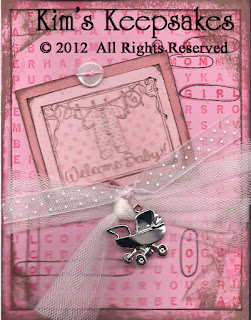
I found out that a friend had a beautiful baby girl tonight, so I had to make a card to include with my gift. I used card stock, inks, and stamps from Stampin' Up! (The rose colored card and dotted pink were in my stash, but they are not SU). I circled the words in the word background that applied to this baby with a journaling pen from Creative Memories. I tied white tulle and a sheer pink ribbon with white polka dots (both from my stash) around the word search, and added a Hallmark baby buggy charm to the ribbon with a pink safety pin from Oriental Trading Company. I used some Scrapper's Floss (Karen Foster) to "tie" on the pink button (my stash).


Wednesday, August 8, 2012
Day 220: Cards for Boys
My kids got invited to some birthday parties and I needed to make some boy cards. Tonight I used stickers from Karen Foster, yellow paper from Creative Memories, a background stamp from Great Impressions, ink from Stampin' Up!, and bits and pieces of leftover papers to create these 5 cute cards.


Tuesday, July 31, 2012
Day 212: #1 Soccer Player
Tonight I worked on 2 soccer pages for my son.
For the left page, I used a soccer background from Bella Blvd, the big round soccer ball paper from Reminisce, chipboard embellishments "soccer" and "#1" from Little Yellow Bicycle, and soccer ball stickers from Karen Foster Designs. I think it is pretty self-explanatory how this page went together, so I won't give details about what I did.
For the right page, I used a soccer collage paper from Little Yellow Bicycle as the background. I selected 3 photos of my son and cropped them to fit inside the postage stamp frames (die and Big Shot machine by Sizzix; black card stock by Stampin' Up!). In the center of the two larger photos, I added a "soccer champ" sticker by Karen Foster. I used my date stamp from Office Max to stamp the month and year around the cluster of photos. I used three epoxy soccer stickers from EK Success to add a triangle shape to the paper that helps to keep the eye moving across the page. I added some info about the team, coach, etc., to the words at the bottom of the page with a journaling pen from Creative Memories. Finally, I added my son's "soccer card" photo to the bottom right of the page and tucked another soccer ball sticker under the left side of the picture, further adding to the collage effect.

For the left page, I used a soccer background from Bella Blvd, the big round soccer ball paper from Reminisce, chipboard embellishments "soccer" and "#1" from Little Yellow Bicycle, and soccer ball stickers from Karen Foster Designs. I think it is pretty self-explanatory how this page went together, so I won't give details about what I did.
For the right page, I used a soccer collage paper from Little Yellow Bicycle as the background. I selected 3 photos of my son and cropped them to fit inside the postage stamp frames (die and Big Shot machine by Sizzix; black card stock by Stampin' Up!). In the center of the two larger photos, I added a "soccer champ" sticker by Karen Foster. I used my date stamp from Office Max to stamp the month and year around the cluster of photos. I used three epoxy soccer stickers from EK Success to add a triangle shape to the paper that helps to keep the eye moving across the page. I added some info about the team, coach, etc., to the words at the bottom of the page with a journaling pen from Creative Memories. Finally, I added my son's "soccer card" photo to the bottom right of the page and tucked another soccer ball sticker under the left side of the picture, further adding to the collage effect.

Monday, May 21, 2012
Day 142: How to Scrap A School Photo Using Pink!
I dug through my stash of goodies to find embellishments for this school photo of my daughter. It is hard to find "school" embellishments that are pastel colors. In order to be used for boys and girls, manufacturers of scrapbook products tend to produce items in primary colors.The background paper is one I had originally bought to use for my daughter's dance album, and then she decided not to dance anymore. The mulberry paper was from a friend who moved away. I used a library pocket by Marcella by K to journal her school information. I used the initial "h" by Making Memories to embellish the library pocket. I wrapped a little scrapper's floss by Karen Foster around one of the legs to add some texture and color to the "h". Heart stickers and a pink flower from Heidi Grace further embellish the envelope. A quote from Making Memories is added to the top of the library card. The quote reads "When I look at you I see the magnificence of another generation in your eyes." A chipboard flower from my stash made a good base for some felt flowers from Stampin' Up! and a flower brad. Another smaller flower and brad enhance the library envelope. Floral tabs by Heidi Grace pull in the pink, yellow, and orange colors from my daughter's sweater. I used some mailbox numbers from Making Memories to show the year. I think it looks pretty good for a pink school picture page!


Thursday, February 9, 2012
Day 40: American Girl ® Magazine Cover Photo Shoot: Page Finished
Feeling much better after a good night's sleep, I had the energy to finish this page up today. As I said yesterday, I selected two papers from Stampin' Up! to use. The pink paper I used as the background, then I ripped the small purple-flower patterned paper into small rectangles to place at the upper left corner and the lower right corner of the 8 x 10 photo. I added a "made in the USA girl" tag (Autumn Leaves) to the lower right corner, on top of the ripped paper. I used a Stampin' Write Marker in Rose Red (Stampin' Up!) to journal around the outside edge of the tag. The journaling blends into the page as it looks like it belongs on the tag. I threaded some pink and purple "scrapper's floss" (Karen Foster Designs) through some pink and purple buttons I got out of my button box, and used those to dress up the page. I kept playing with putting my daughter's initial underneath all the writing on the magazine cover, but I ultimately decided it just looked too heavy and overcrowded.

Subscribe to:
Posts (Atom)